前端布局和小细节
文档流
所谓的文档流
指的是元素排版布局过程中,元素会自动从左往右,从上往下的流式排列。
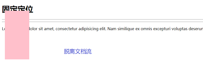
脱离文档流
也就是将元素从普通的布局排版中拿走,其他盒子在定位的时候,会当做脱离文档流的元素不存在而进行定位。
document flow => normal flow
本质:普通流/常规流
流:水流 河流 泥石流 => 自上而下(连续的),连续的
文档:页面主体

文档流:一个连续具有逻辑上下的页面整体
理解:出现在页面中的显示内容,均可以理解为在文档流中(片面的)

概念:将窗体自上而下分成一行一行,块级元素从上至下、行内元素在每行中从左至右的顺序依次排放元素。

BFC:Block formatting context
概念:由block-level box参与布局,同一区域(容器空间)中,相互影响,且不会对区域外产生影响
1 |
|
父子都是块级元素
1 |
|
真相
这时,子元素设置为了父元素width的100%,那么子元素的宽度也是500px;
但是如果我们把子元素的width去掉之后,就会发现子元素还是等于父元素的width。也就是说,对于块级元素,子元素的宽度默认为父元素的100%。
当我们给子元素添加padding和margin时,可以发现宽度width是父元素的宽度减去子元素的margin值和padding值。
毫无疑问,如果去掉子元素的height,就会发先子元素的高度为0,故height是不会为100%的,一般我们都是通过添加内容(子元素)将父元素撑起来。
父:块级元素 子:内联元素

1 |
|
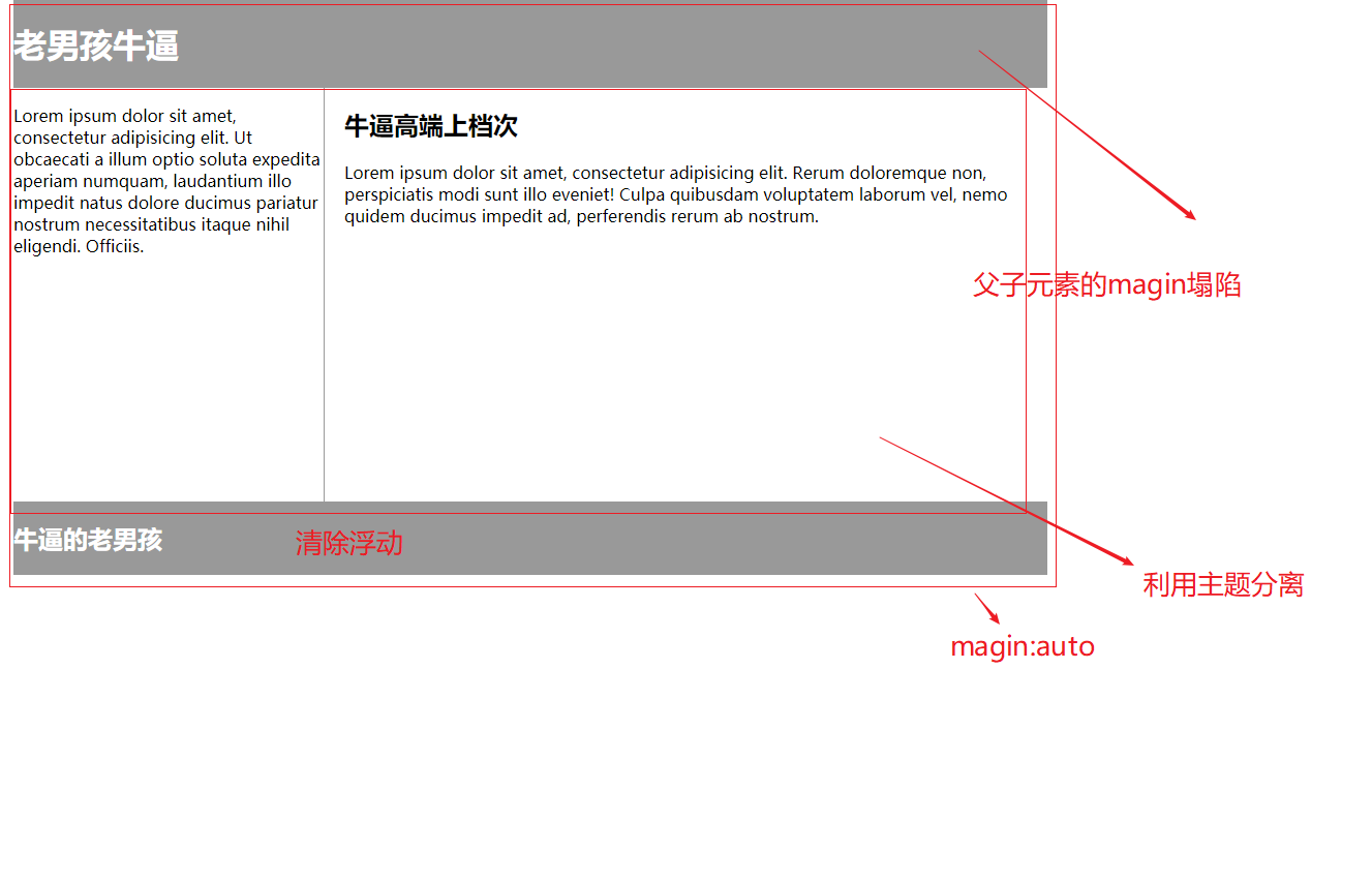
父级坍塌现象
1 |
|
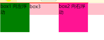
例子如上:.container和box3的布局是上下结构,上图发现box3跑到了上面,与.container产生了重叠,但文本内容没有发生覆盖,只有div发生覆盖现象。这个原因是因为第一个大盒子里的子元素使用了浮动,脱离了文档流,导致.container没有被撑开。box3认为.container没有高度(未被撑开),因此跑上去了。
弹性布局flex布局
1 |
|
响应式布局
1 |
|
例子
1 |
|
display
1 | 块:1.独行显示 2.支持宽高,宽默认适应父级,高默认由子级或内容撑开 3.设置宽高后,一定采用设置的宽高 |
1 |
|
隐藏
1 |
|
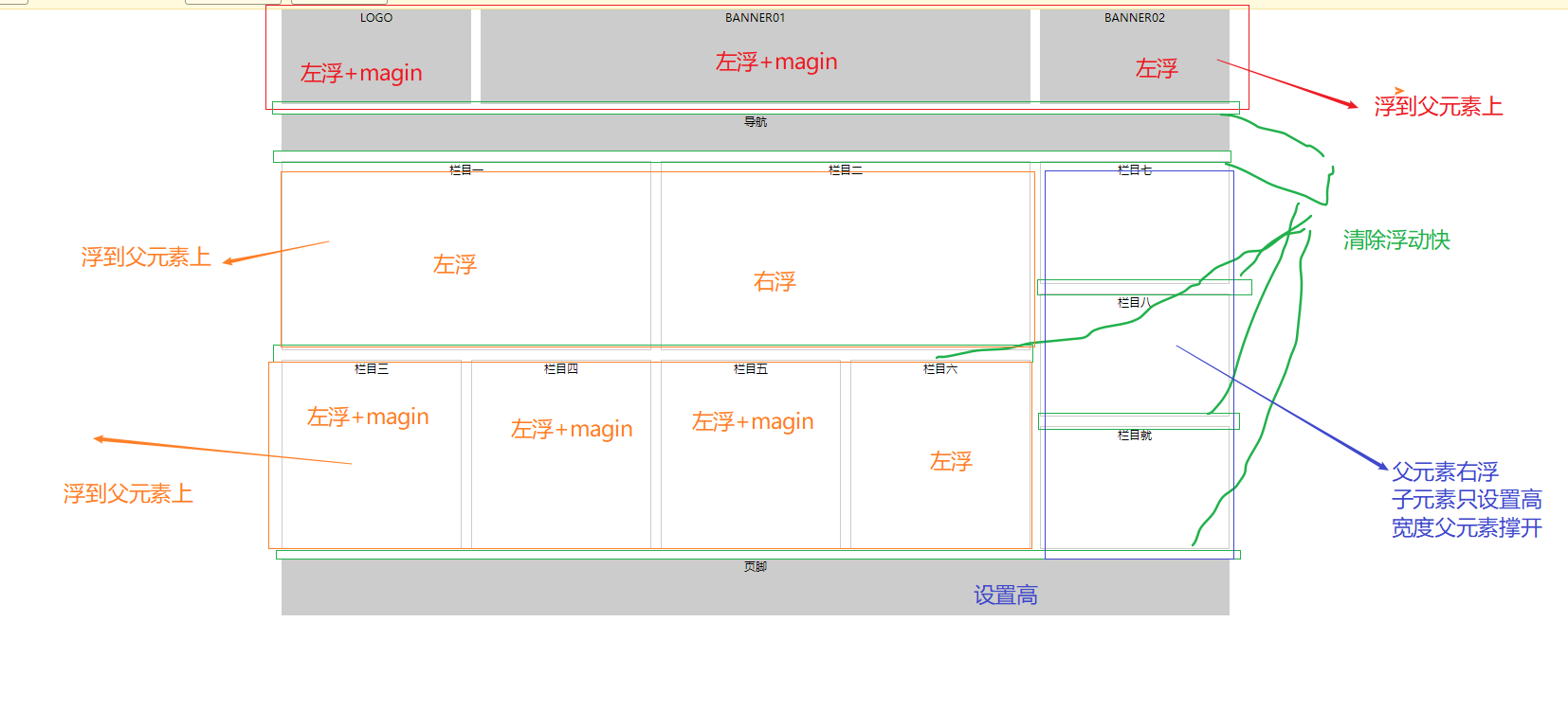
浮动
1 |
|
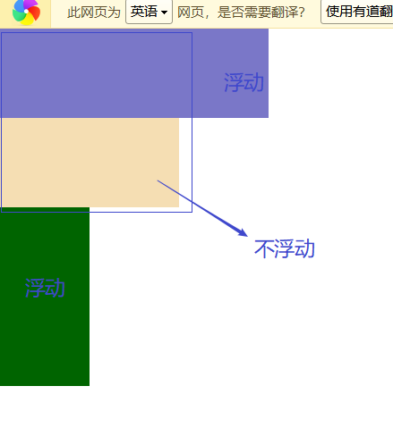
假如某个div元素A是浮动的,如果A元素上一个元素也是浮动的,那么A元素会跟随在上一个元素的后边(如果一行放不下这两个元素,那么A元素会被挤到下一行);如果A元素上一个元素是标准流中的元素,那么A的相对垂直位置不会改变,也就是说A的顶部总是和上一个元素的底部对齐。此外,浮动的框之后的block元素元素会认为这个框不存在,但其中的文本依然会为这个元素让出位置。 浮动的框之后的inline元素,会为这个框空出位置,然后按顺序排列。
1 |
|
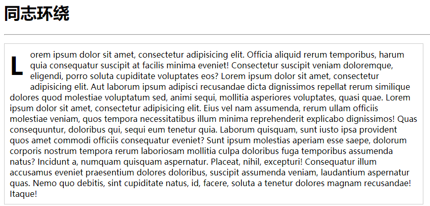
首字符环绕
1 |
|
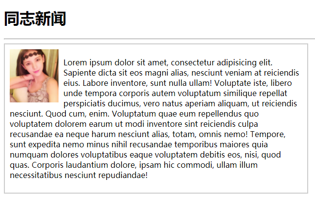
文字环绕图片
1 |
|
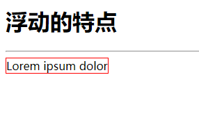
浮动的特点
块状元素文本变成浮动宽度的字体不能默认被字体撑开
1 |
|
浮动影响

1 |
|
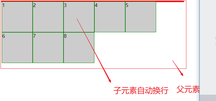
多个浮动超过父元素的宽
1 |
|
布局实例
1 |
|
布局实例2
1 |
|
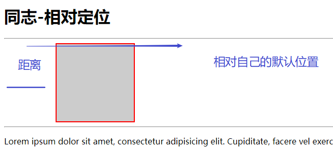
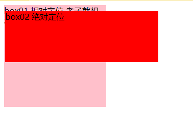
相对定位
设置为相对定位的元素
1 |
|
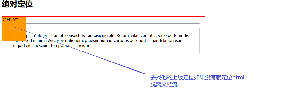
绝对定位
去找他的上级定位如果没有就定位html
脱离文档流
1 |
|
对象不会随着滚动
fixed:对象脱离正常文档流,使用top,right,bottom,left等属性以窗口为参考点进行定位,当出现滚动条时,对象不会随着滚动。而其层叠通过z-index属性 定义。 注意点: 一个元素若设置了 position:absolute | fixed; 则该元素就不能设置float。这 是一个常识性的知识点,因为这是两个不同的流,一个是浮动流,另一个是“定位流”。但是 relative 却可以。因为它原本所占的空间仍然占据文档流。
在理论上,被设置为fixed的元素会被定位于浏览器窗口的一个指定坐标,不论窗口是否滚动,它都会固定在这个位置。
示例代码:
1 |
|
绝对定位例子

1 |
|
固定定位
1 |
|
z-index
1 |
|
屏幕中央
1 |
|
字体图标
1 |
|